
The Pans Team Portal:
A New Ingredient for Productivity
Design of an intranet for Pans & Company
Pans & Company has challenged us to redesign their intranet for all company members, who are spread across franchises around the world. As part of the company’s commitment to inclusivity and making life easier for all employees, the design must ensure ease of use, regardless of any limitations its users may have.
Used tools
Challenge
Redesign Pans & Company’s intranet ensuring a proper usability and accessibility.
My role
Design the product taking into account all design phases, from user research to prototyping of the final design.
Methodology
For this challenge, I will use the Design Thinking methodology as a framework.
Organization of tasks
As we only have 3 days to complete the project, it is crucial to have good organization. To achieve this, we created a Trello board, arranging the tasks according to the expected day to complete them.

01. RESEARCH
In a real-life scenario, I would start the research by conducting a questionnaire with the employees to get a detailed understanding of their opinion about the company, its strengths, and weaknesses. It would also be wise to have conversations with some of these workers to have a deeper understanding of this topic and extract more specific data.
Since this type of user research is not possible on this occasion, we have chosen to seek opinions from the workers through other channels, like Infojobs, Glassdoor, and Indeed.
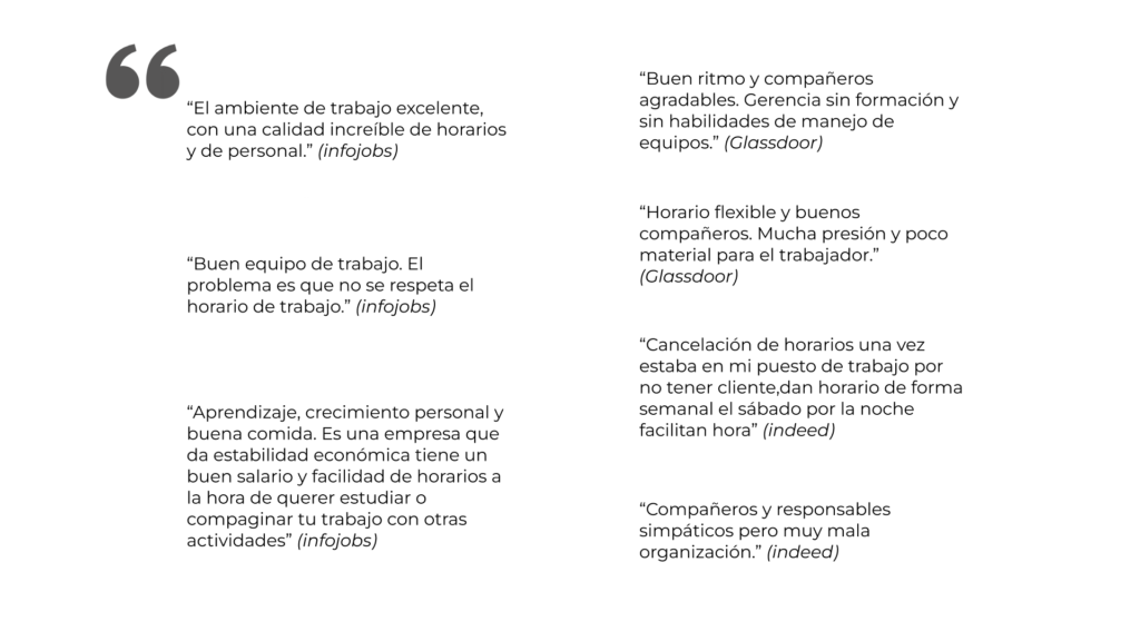
As we can see, most users express that the working environment within Pans & Company is excellent, and both staff and managers work together to create a good work environment.
One of the most repeated problems is the lack of organization of shifts and worker schedules, as well as not having schedules in good time.
Finally, the absence of training materials or resources for the worker has been mentioned in several comments. Including a training section could be a valuable aspect in improving the performance and qualification of workers, as well as their well-being.
User personas
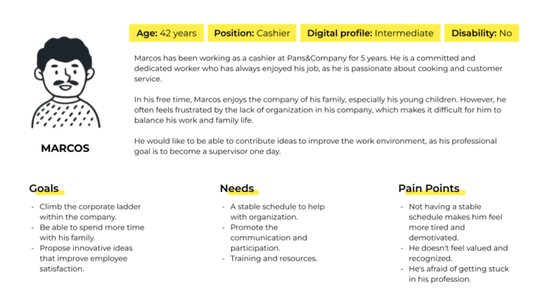
It is important to keep in mind that this platform is focused on being useful for workers. Therefore, we have created two user personas which will help us to represent the ideal users interacting on our platform.

User journey
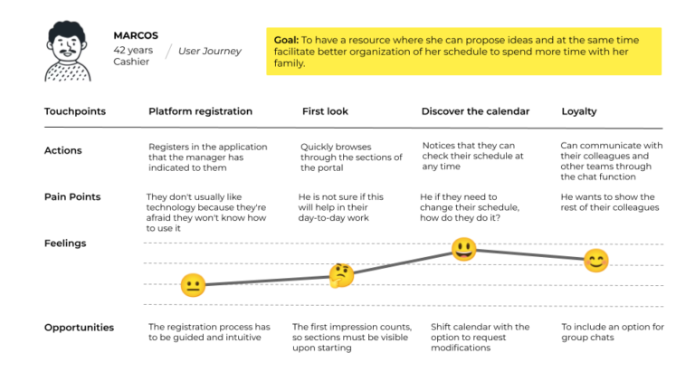
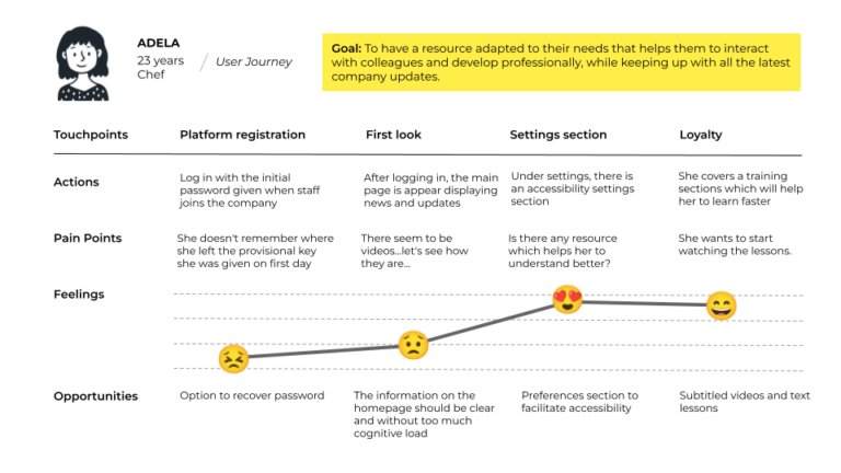
Once our users and two user journeys are defined, we can use this technique to see how our users would interact with our product step by step.
Afterwards, we will see how our users interact at each touchpoint, taking a detailed look at the pain points and their emotions at each moment, as well as the opportunities that arise for its development.
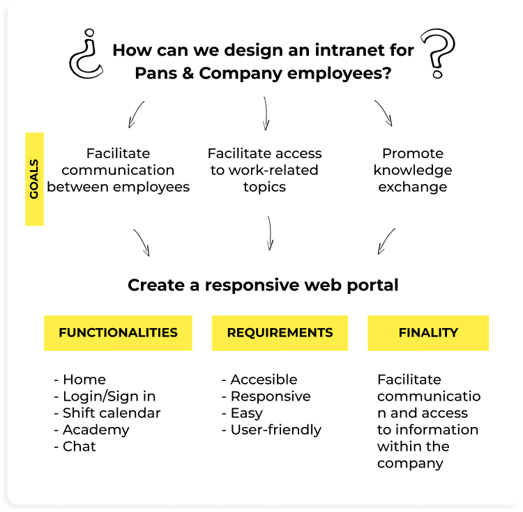
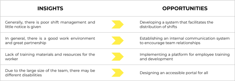
Thanks to all the data collected in this research phase, we can extract some of the most important insights which will help us to understand better the needs, desires, expectations, and behaviors of users. We will turn all these issues into opportunities that will add value for both employees and the company.
02. SITE DESIGN
Before starting with the visual part of the design, we defined the site map. This visual tool will help us to define the structure of the intranet and its organization. The main objective is to plan the structure and organization of the site before starting to work on its construction.

03. WIREFRAMES
Once we had decided the structure of the intranet, we created the first low-fi wireframes: sketches without too many visual details which help us to decide how the interface shall be.
LOGIN & SIGN IN
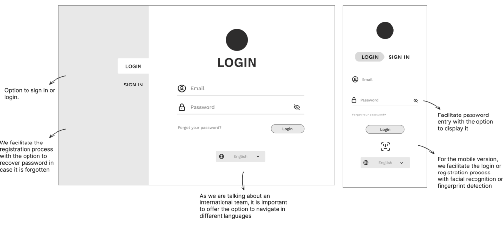
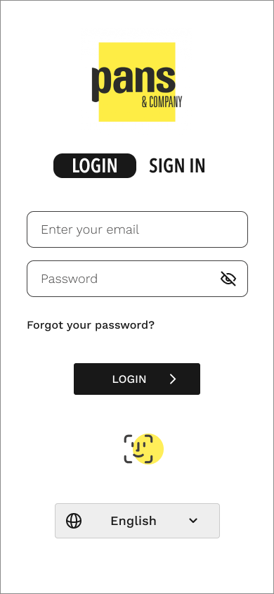
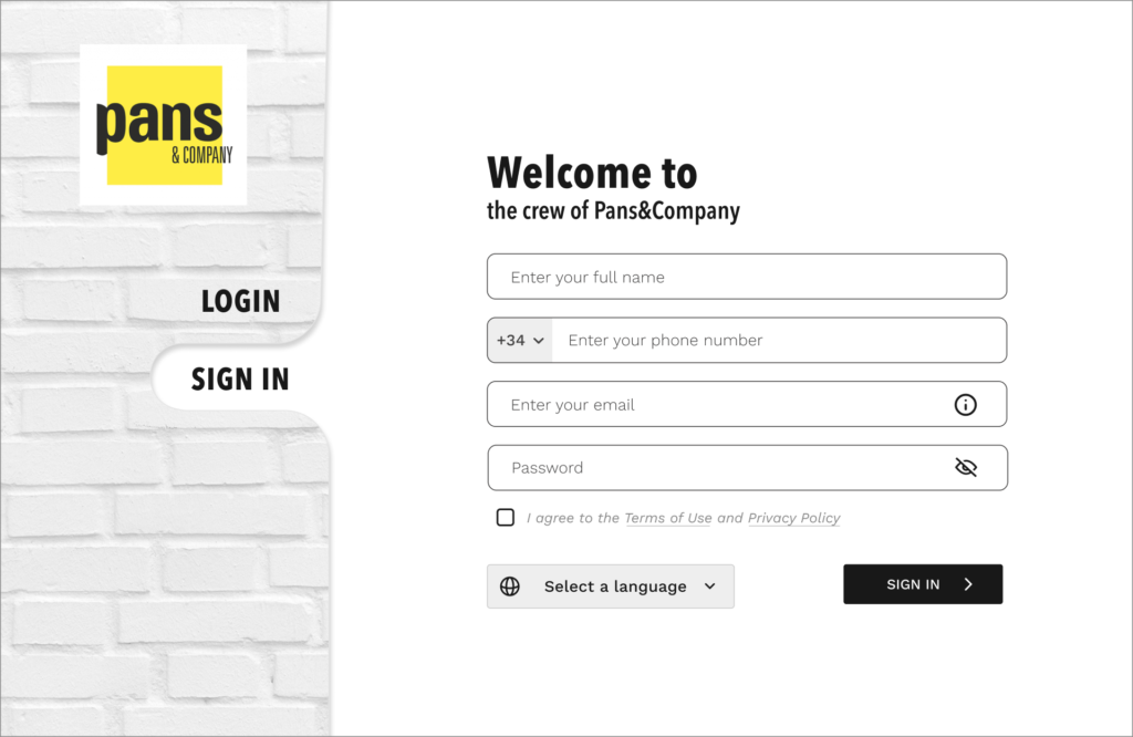
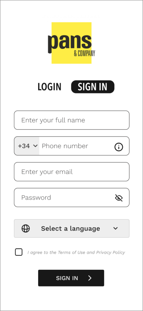
For the login and registration process, we have created a simple and clean design. The goal is to make the login process as simple as possible. The design aims to be intuitive while including elements to assist in case any problem or question arises during the process.

HOME
CALENDAR
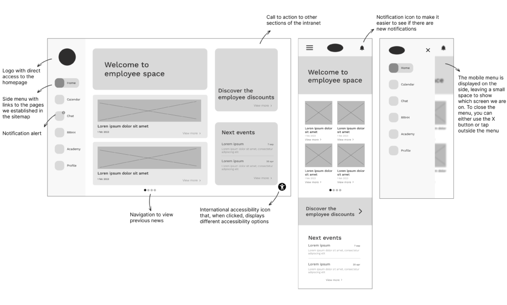
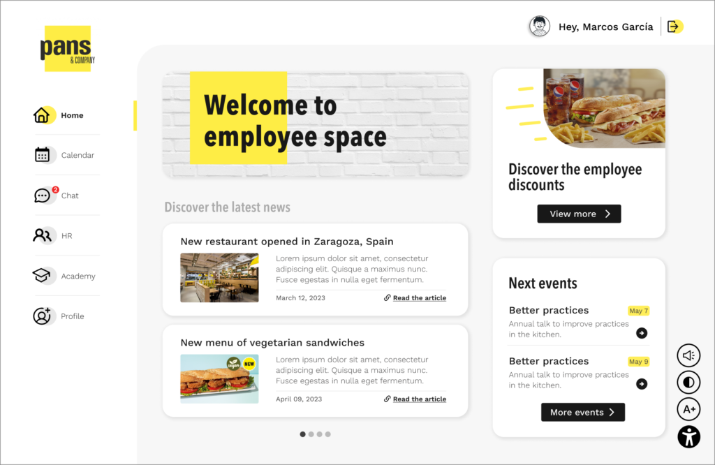
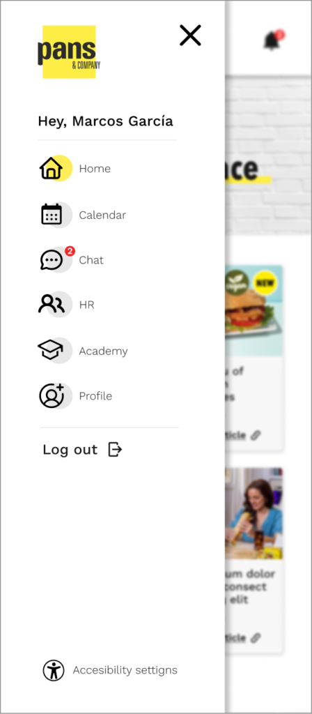
We chose a dashboard-style design for the intranet, in order to make all the web resources visible from the beginning and avoid scrolling on the desktop version. For the homepage, we elected a simple design that mainly displays news, articles, and events related to the company. In addition, we have included a top banner as a call to action where direct access to sections of the intranet will be displayed, such as access to discounts.
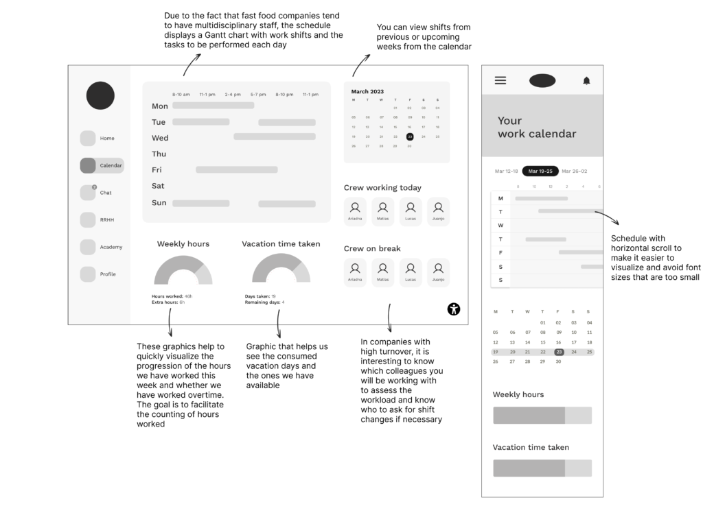
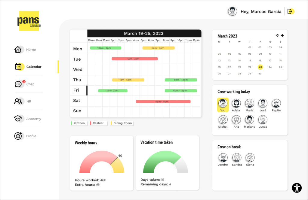
For this section, we have created a calendar adapted to the needs of fast food restaurants. Creating it, we noticed that the need to make a calendar is different from what we are used to (such as Teams or Google Calendar) since business needs are different.
The design is simple. We can see in the first section the shifts for the current week, which indicate through a color system the tasks to be performed within each shift.
We have also considered other values that could be relevant to the workers, such as the actual working hours, vacations, and other staff members working along different shifts.
04. DESIGN SYSTEM
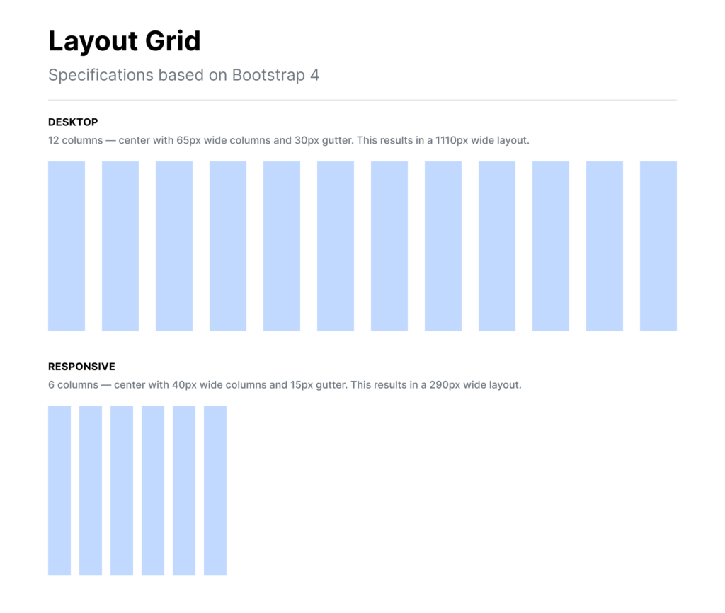
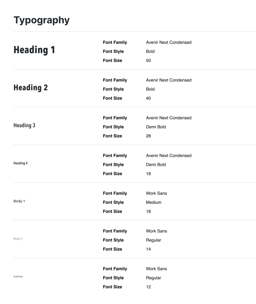
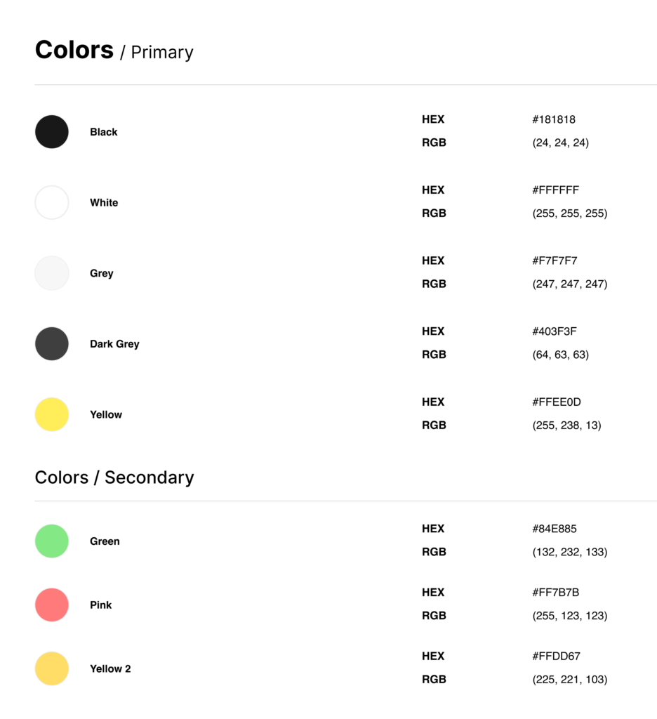
Establishing design patterns will help us to create consistency in interface design. in order to define them, we have taken the current design of the Pans&Company website and app as a reference.

05. PROTOTYPING
LOGIN & SIGN IN

HOME

CALENDAR

06. ACCESSIBILITY
Below we will show a series of accessibility recommendations created based on WCAG 2.1 and will follow the four principles established by WCAG (Perceivable, Operable, Understandable & Robust). The WCAG principles are divided into three A leveles (A, AA, AAA).
Following this series of guidelines will help us develop the design in the most accessible way possible.
Perceivable - media
• Include text alternatives except for captchas (A)
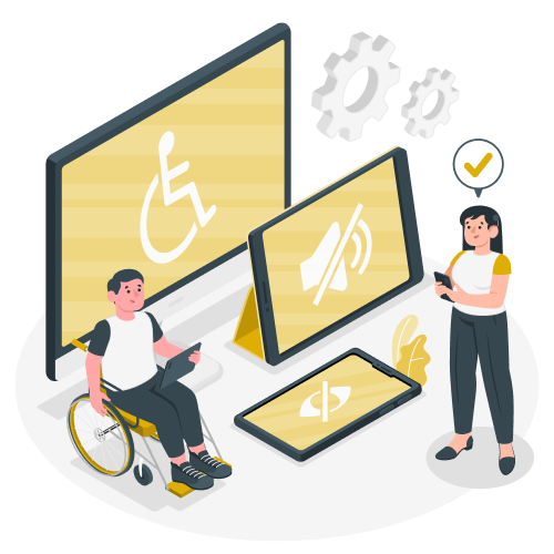
The images need to be provided with a brief description of what there is on the image. That way users who use screen readers are able to understand the meaning and intent behind the read elements.
• Provide transcriptions and subtitles in videos and audios. Also, provide the option for other formats such as presentations or PDFs. (A)
In the Academy section, the training videos will be subtitled. That way users with hearing and vision difficulties can access the content through reading or listening the text alternatve with screen readers.
• Sign-language as a complement to videos (AAA)
• Prioritize text over images with text, except in essential cases such as the logo (AA)
In the interface, images only appear as a decorative element and are always accompanied by a descriptive text.
• Provide a mechanism for controlling the volume of the website if it has audio lasting longer than 3 seconds (A)
Perceivable - text & color
• Except for subtitles and images, all text should be able to be enlarged to 200% of its size without the need for technical aids (AA)
In the button with the accessibility icon that appears in the lower right corner, users can make the text larger or smaller.
• Good interline spacing and text spacing (AAA)
Thanks to the Layout Grid established in the design system, we guarantee correct spacing.
It would be advisable to establish a fixed line spacing for the different typography styles.
Operable
• The entire website can be navigated solely using the keyboard (AAA)
In the development phase, a layout that allows keyboard navigation will be established. This improves accessibility for people with visual or physical disabilities.
• The user has enough time to interact with the content (AAA)
• The user does not lose any data after re-authenticating on the platform (AAA)
The intranet is linked to the Pans&Comapny database and is regularly updated in order to store all information so that it is not lost.
• Titles, tags, and headers are descriptive and allow for full meaning reading (AA)
Titles, descriptions, button names are descriptive and in line with their functionality.
• The user knows at all times which part of the website they are in (AAA)
One of the indicators to know which page we are on is the change of color in the menu label.
Understandble
• The language is adaptable, except for proper nouns or words that should not be translated (AA)
From the login and registration screens the user has the option of selecting the language.
• When a more advanced level of reading is required (beyond basic secondary education), a simpler alternative version is provided (AAA)
• Navigation elements and other components must always have the same order (AA)
The elements will not change their order as you navigate. An example is the navigation menu buttons, which maintain their position on all pages.
• A system for preventing errors is provided by giving the user the option to undo, review, confirm the change… (AAA)
Robust
• Good syntax of the markup language is followed. All tags are closed, IDs are unique, elements are well nested… (W3C validation) (A)
Ensuring a good syntax provides a correct visualization in different devices, avoiding errors and visualization problems.
• User-provided interface names can be provided (A)
The user may have the option, if desired, of modifying some of the names
